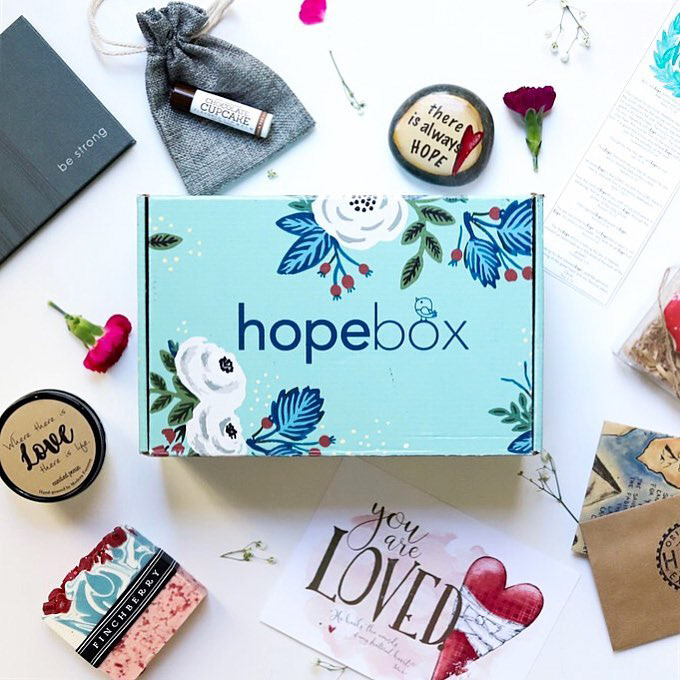
Hopebox was created with helping people going through a loss or grieving, sending comfort within a monthly box which comes with words of comfort or goods crafted from artisans all over. While just 'stuff' cannot fill a void or heal pain the content is meant to be experiential and help with self care during a difficult time. I fell in love with their mission and I worked with them to develop their brand and logo and launch on cratejoy.
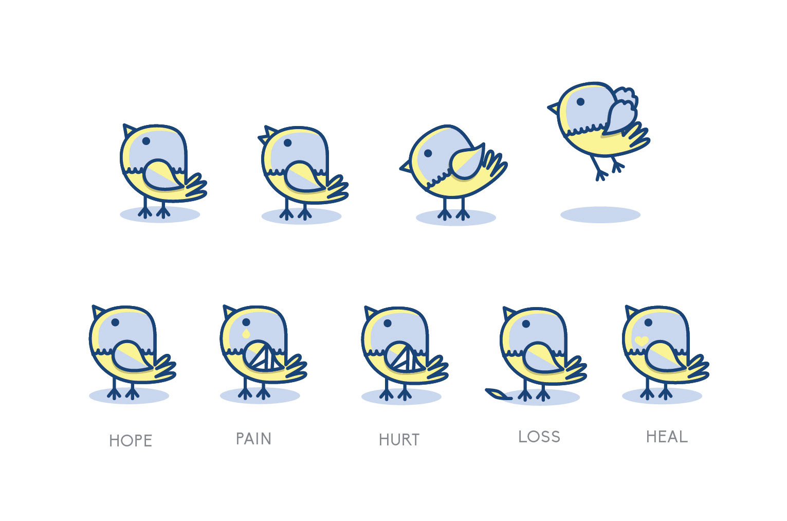
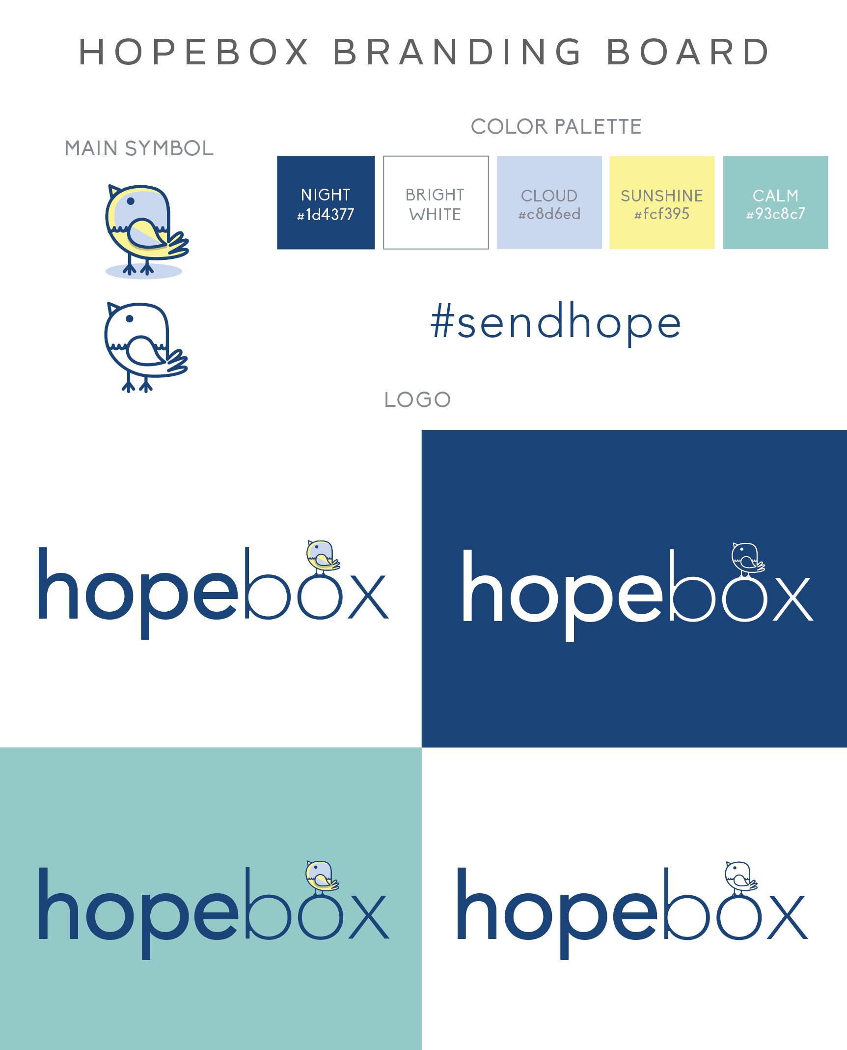
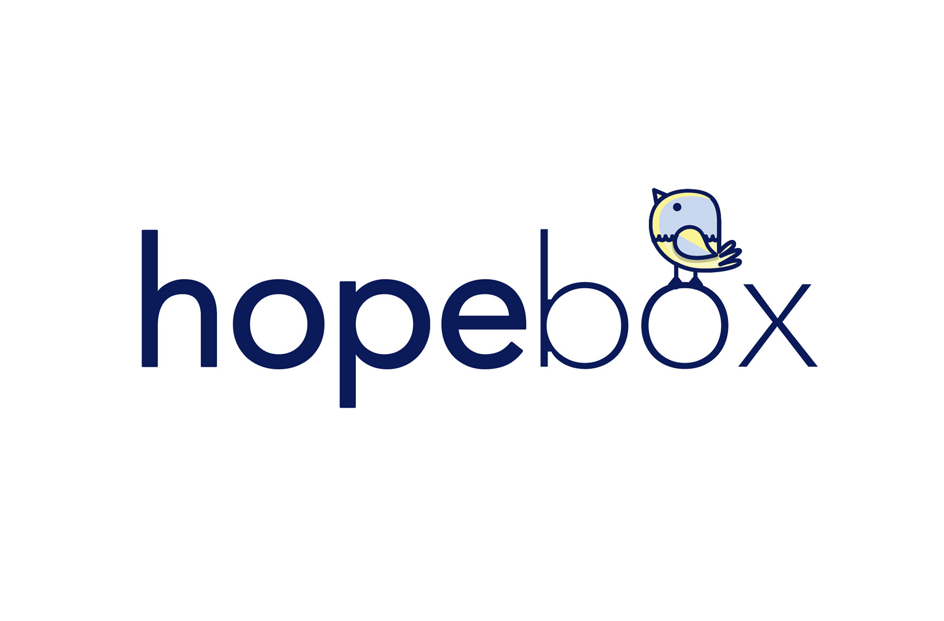
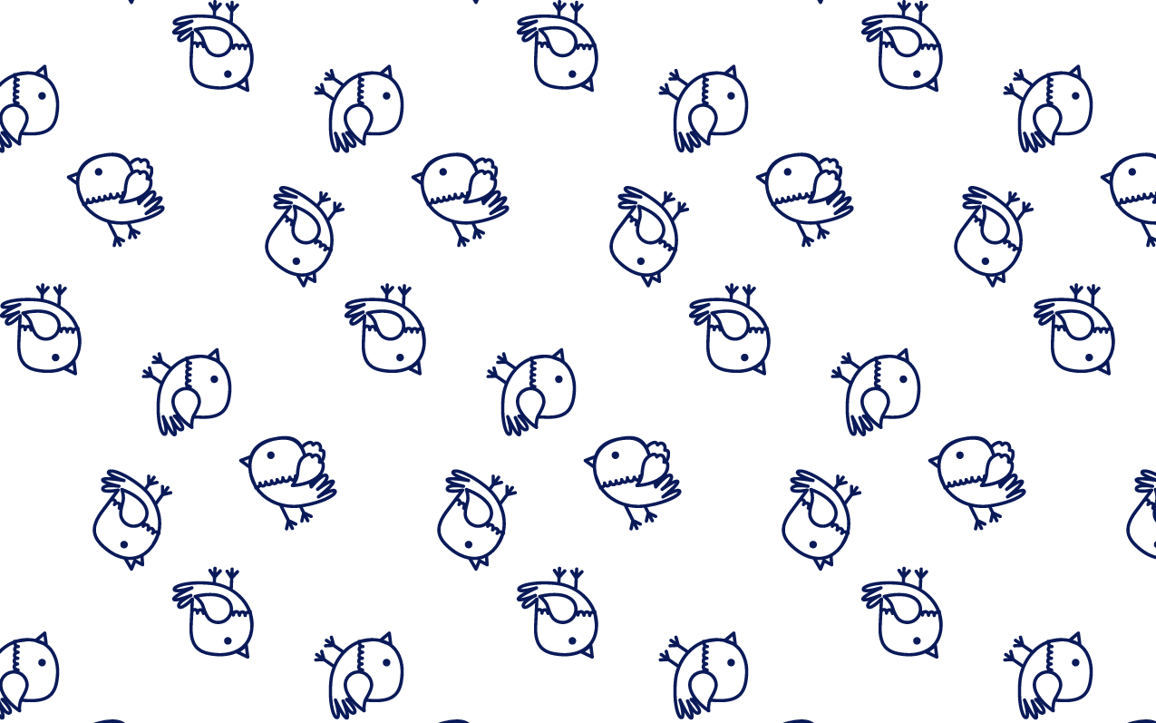
Hopebox needed a brand to reflect their uplifitng message and the bird became the perfect motif. Clean typography and a crisp color palette fell into place after that.
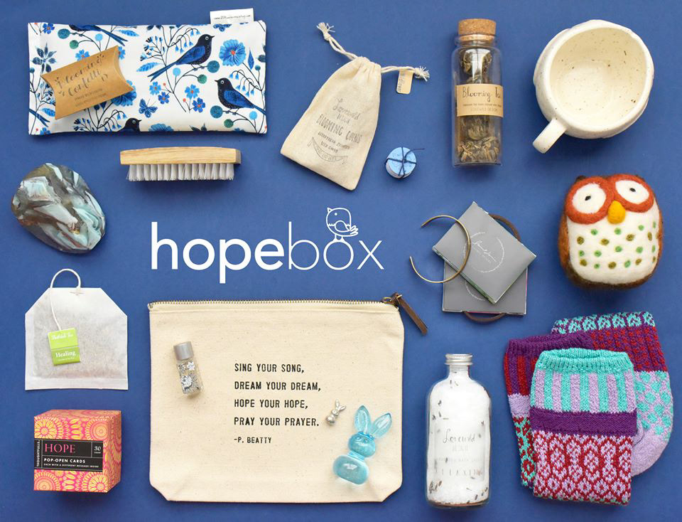
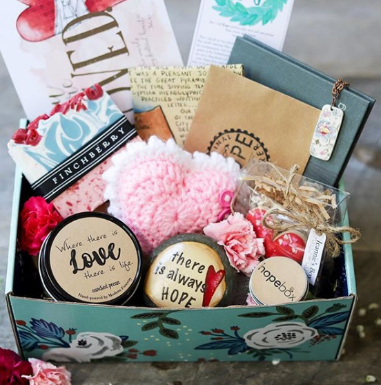
After the branding and was set in place I worked on the premier box design. Color Psychology played a huge role and we settled on a calming tone for the outside and bright and sunny for the inside. Vintage floral elements became the accent pieces covering the box.
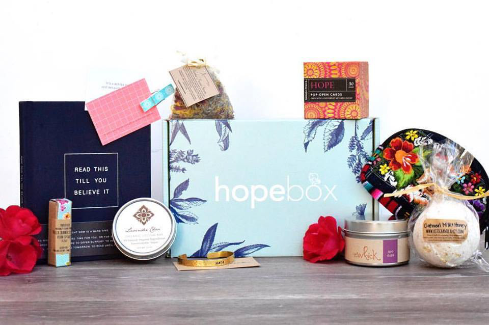
The first box design was a big success, and Hopebox wanted the design to evolve to work for both the fall and winter seasons. The collection of artisanal goods was forming around the season they were being sent. The revised design had to work within the branding while looking fresh and new. The goauche flower illustration was the perfect hand-crafted feel to coordinate with the brand.
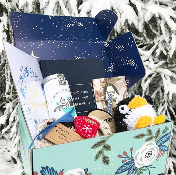
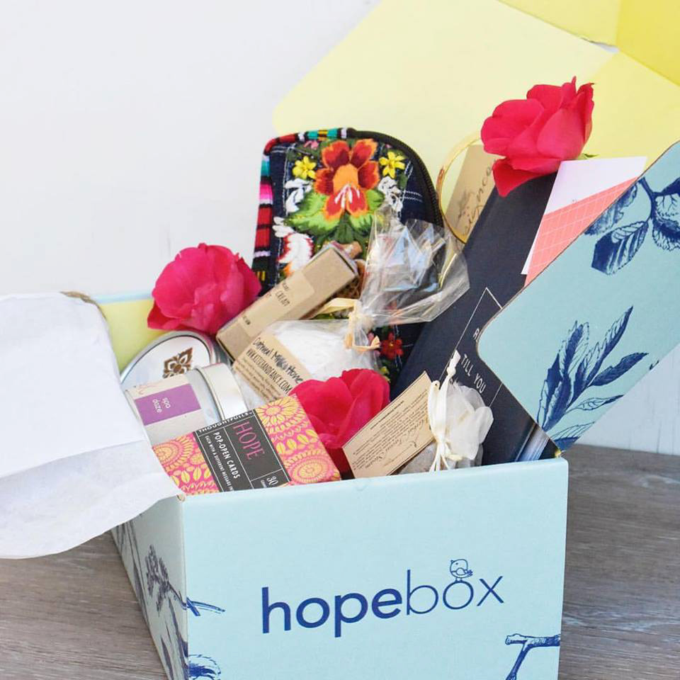
The inside of the box was my favorite element. The interior features a full color print of a wintery night sky with one shining extra bright. It resounded with Hopebox's mission to bring comfort.
Photography courtesy of Hopebox.