I grew up helping my dad milk cows on our family farm and spent the summers selling Prairie Farms ice cream out of the State Fair ice cream truck.
When Prairie Farms approached relaunching their ice cream, it was a back-to-basics moment for the brand; one where they could reflect the essence of being a company that sells wholesome, dairy products. They source their dairy from local, family-owned farms held to the highest standards. Also they had recently reformulated their recipes to have clean labels.
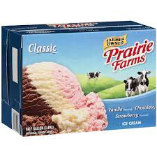
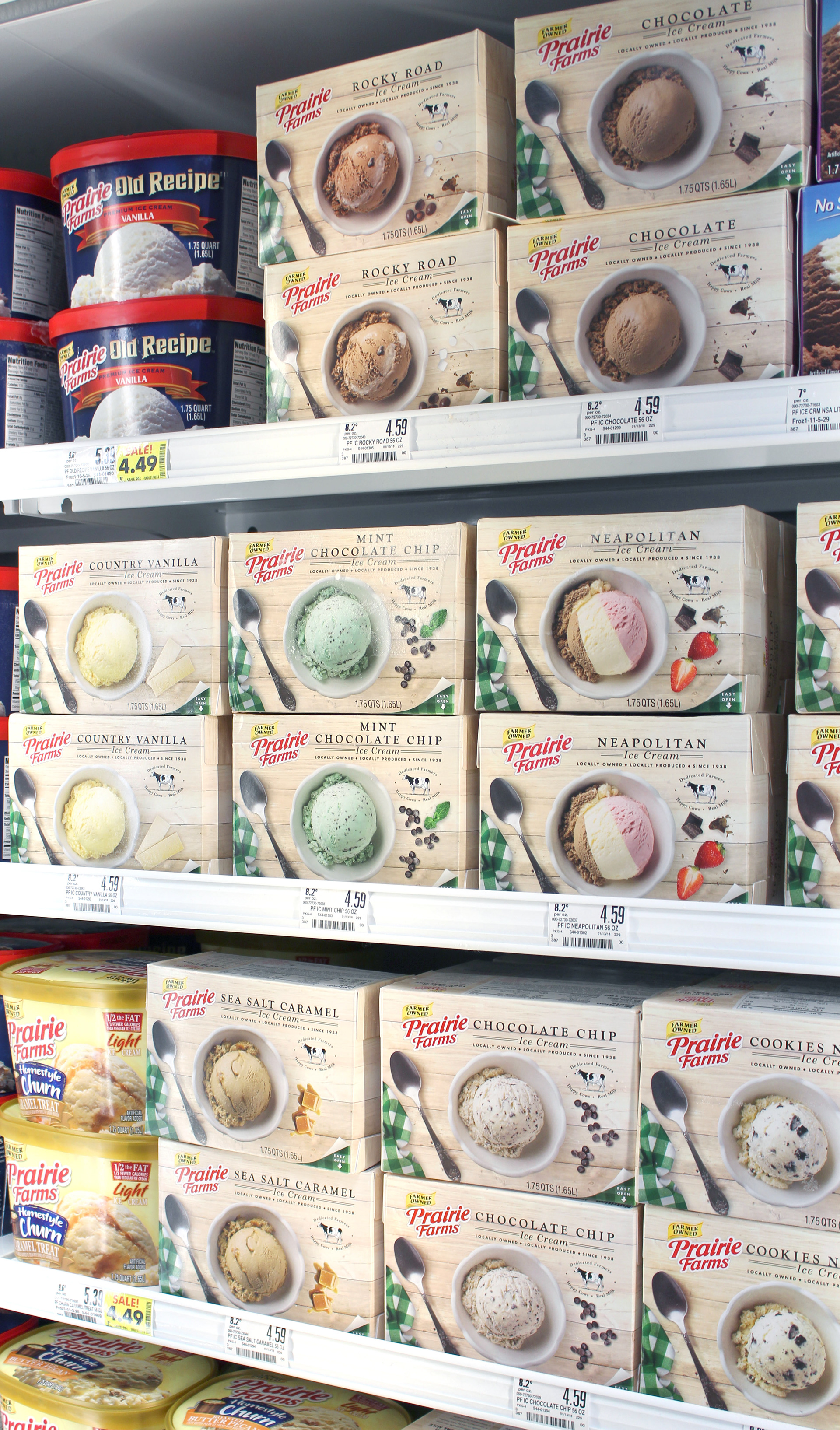
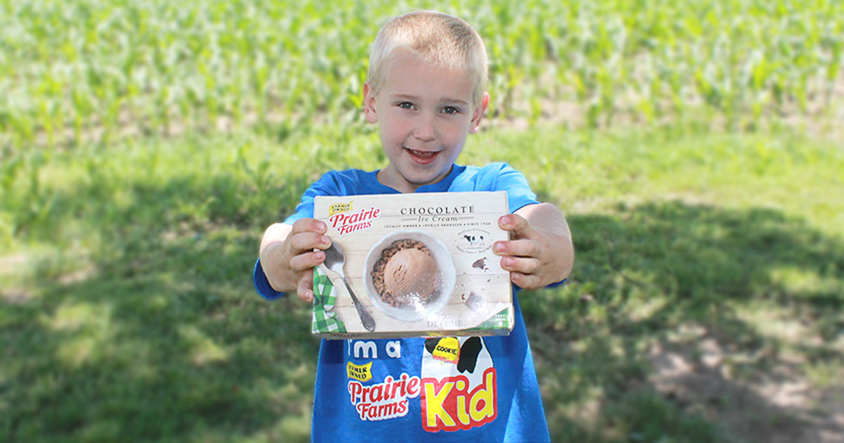
The previous carton was dated, and didn't communicate Prairie Farms' local roots and clean-label.
The main ingredients for each flavor were simple:
milk, cream, and sugar.
We let this back-to-basics approach drive the redesign.
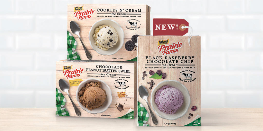
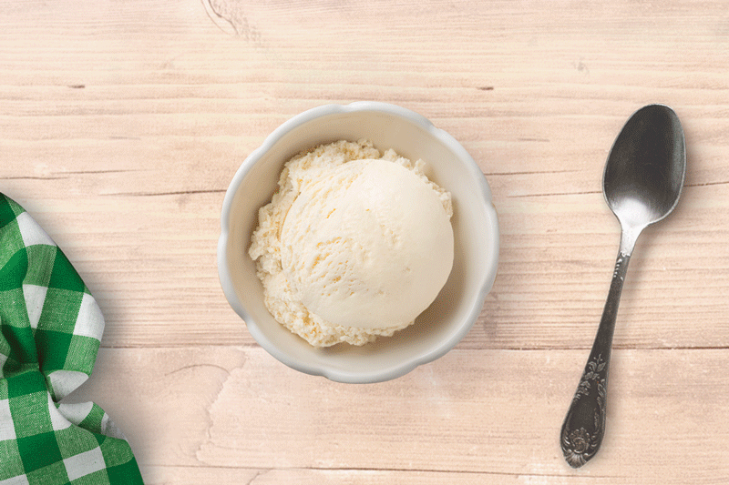
The dedication to food that's simple and naturally good was the basis to the packaging. It brought great creative potential and I was excited to design the packaging. I set to work setting up a style that would work for the 22 clean-label flavors. The original product photography needed updating so we directed the product photography to use real ice cream at a straight-on top down view.
The new 'craft' look proved to become an integral part of the Prairie Farms branding moving forward.
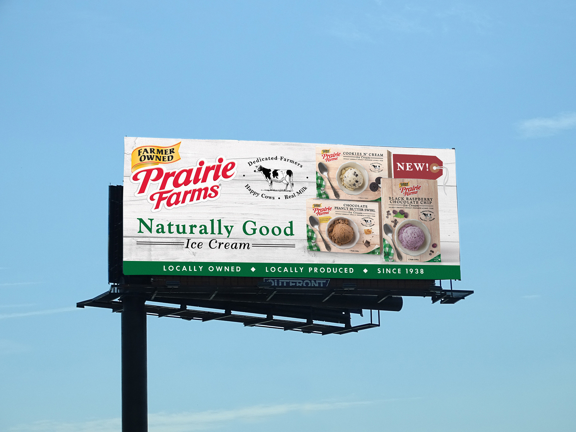
The new package design led the way to a new Naturally Good campaign. This included a billboard against the St. Louis skyline.
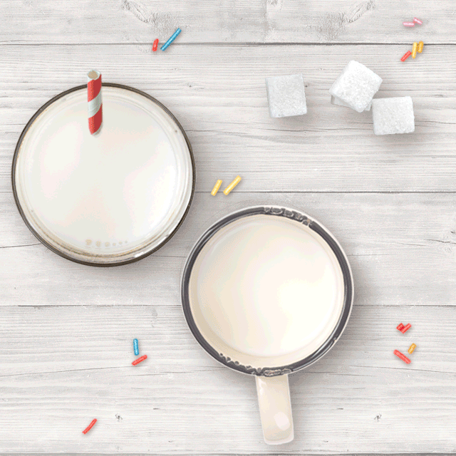
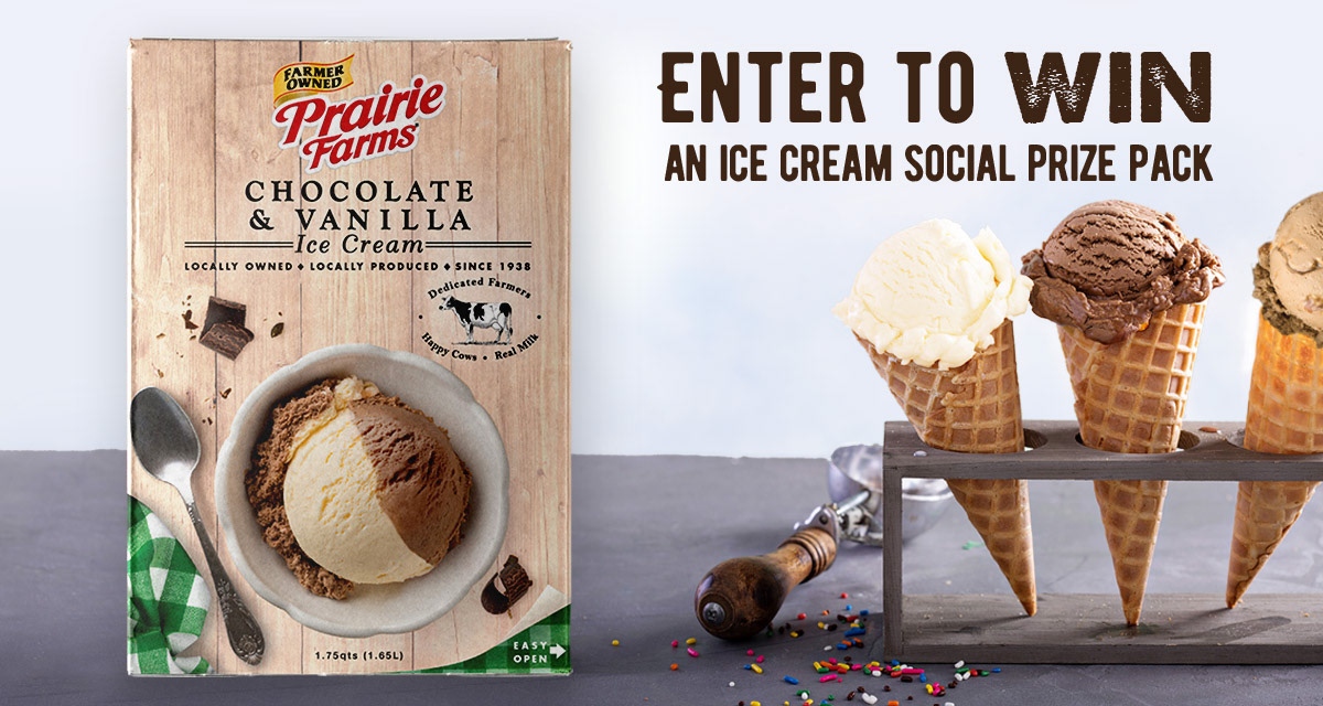
The new packaging came out before National Ice Cream Month, so a digital marketing campaign followed. I set up the gifs and graphics inviting consumers to enter to win free ice cream.

With so many delicious flavors, recipes were needed for website content and to share on social platforms. I curated recipes for each flavor from ice cream cakes to floats.

Thanks for looking!