Prairie Farms Dairy, a renowned Midwest dairy brand, sought to refresh the packaging for its Small Batch Ice Cream line to better reflect its premium quality, artisanal production, and Midwest heritage. The objective was to create a new design that not only appealed to a broader, more discerning audience but also stayed true to the brand’s local roots and longstanding reputation for quality.
Challenge:
The primary challenge was to elevate Prairie Farms’ Small Batch Ice Cream as with a new identity system that could be implemented across the portfolio of products for further brand recognition. Additionally, the design needed to resonate with consumers who value local, high-quality ingredients, while standing out on increasingly crowded supermarket shelves.
Objectives:
Elevate the brand to a more premium positioning through design elements.
Highlight the small-batch, handcrafted quality of the ice cream.
Create visual differentiation from the core Prairie Farms dairy products.
Ensure that the design remains authentic to Prairie Farms’ Midwest heritage.
Appeal to a younger, upscale audience while retaining existing customers.
Strategy:
The redesign focused on blending modern design trends with traditional elements that reflected the heritage and artisanal aspects of the product. The new packaging had to be bold, clean, and engaging, with an emphasis on the craftsmanship behind the product.

Key Strategic Elements:
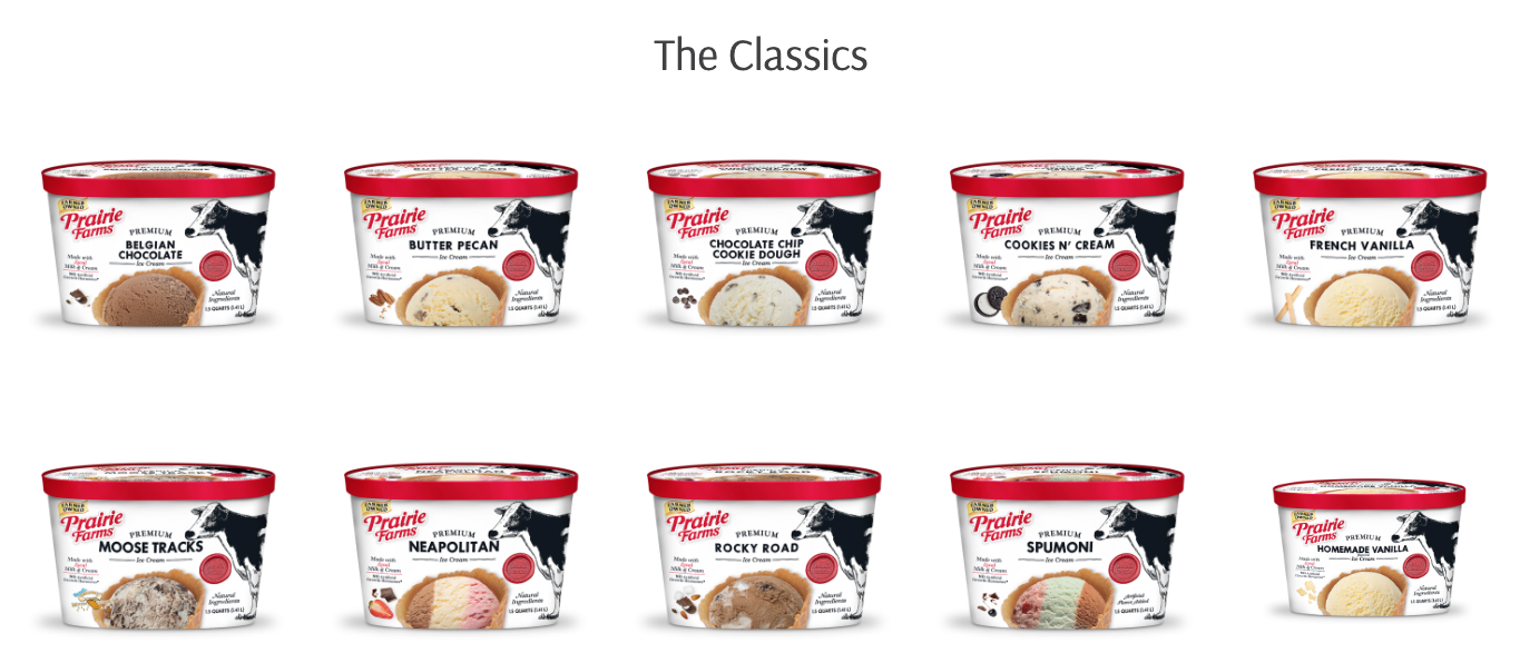
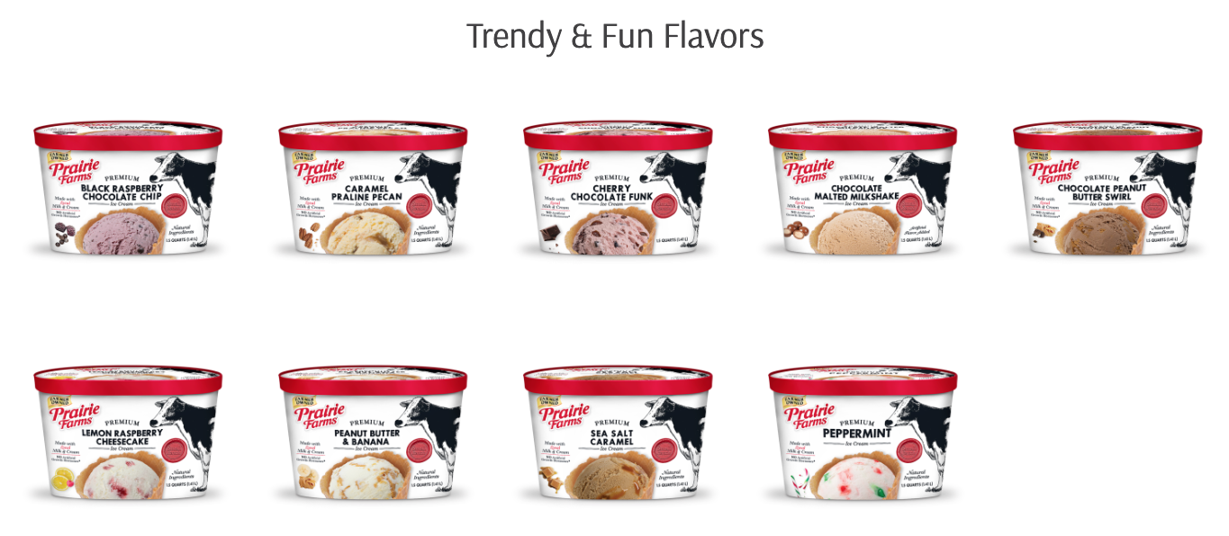
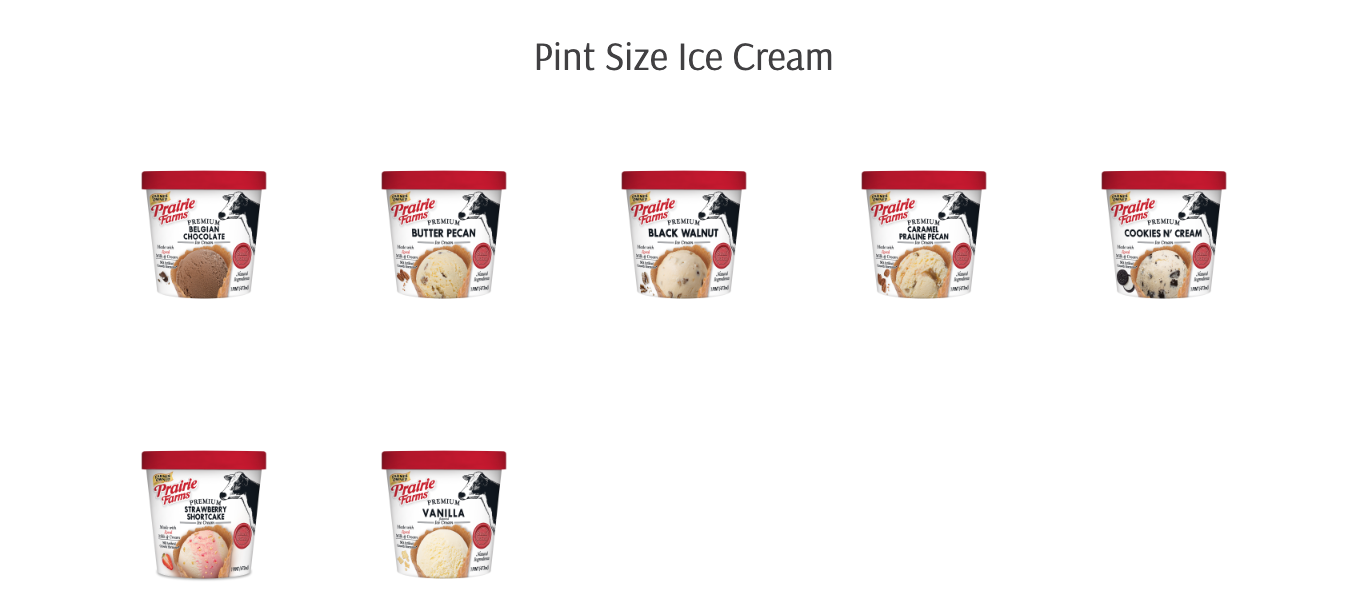
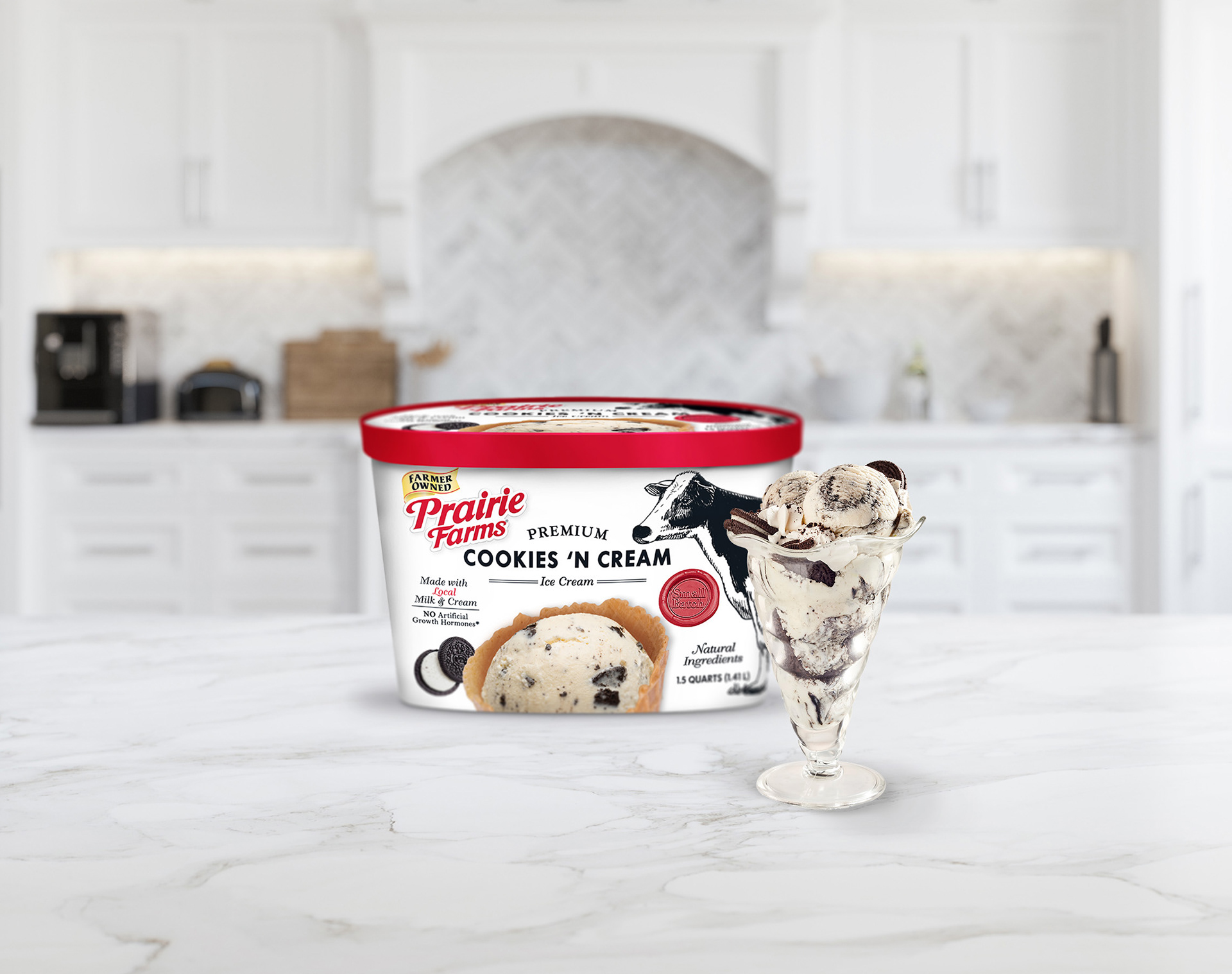
Premium Aesthetic: The design introduced elegant typography and high-quality imagery, showcasing the ice cream’s rich texture and high-quality ingredients.
Handcrafted Feel: Elements such as hand-drawn illustrations and a tactile label texture were incorporated to reflect the small-batch, handcrafted nature of the product.
Sustainability Consideration: The packaging was also designed with sustainability in mind, using recyclable materials to align with growing consumer demand for eco-conscious products.
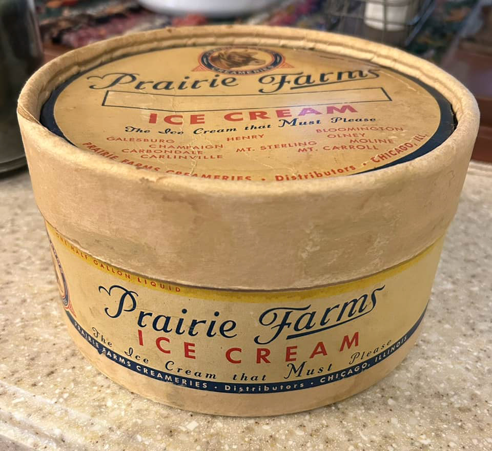
I drew inspiration from the original 1940's design for the classic typography elements.
Results:
The redesigned packaging successfully differentiated Prairie Farms’ Small Batch Ice Cream as a premium product within the company’s portfolio. Initial feedback from consumers indicated a stronger emotional connection to the brand, with many appreciating the authentic, handcrafted feel of the packaging. Sales of the Small Batch line increased by 15% in the first three months following the redesign, with new customers expressing increased interest in the product based on its elevated presentation.
Conclusion:
The Prairie Farms Small Batch Ice Cream packaging redesign helped the brand position itself within the premium category while staying true to its local, artisanal roots. Through thoughtful design choices that communicated both quality and heritage, the packaging not only stood out on shelves but also deepened customer loyalty and expanded its consumer base.