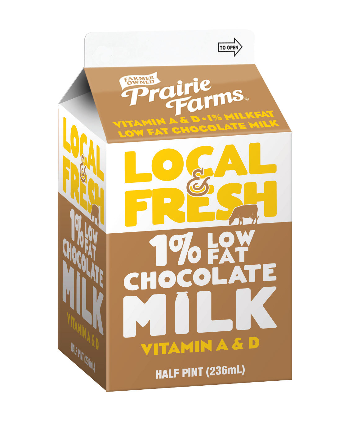
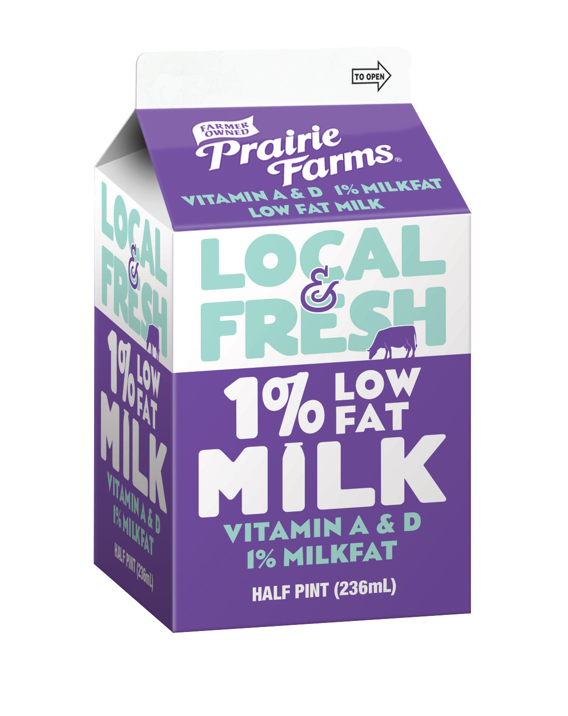
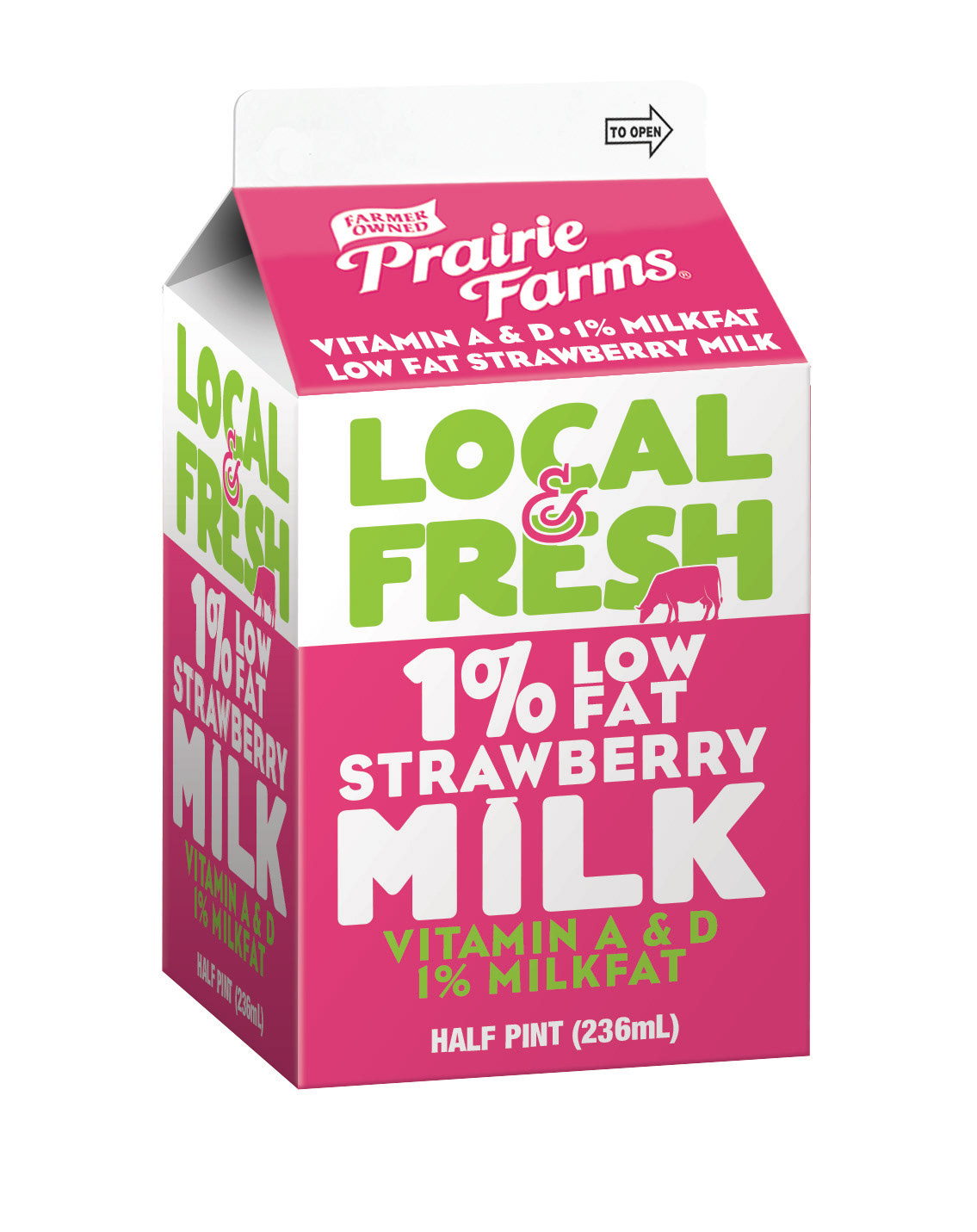
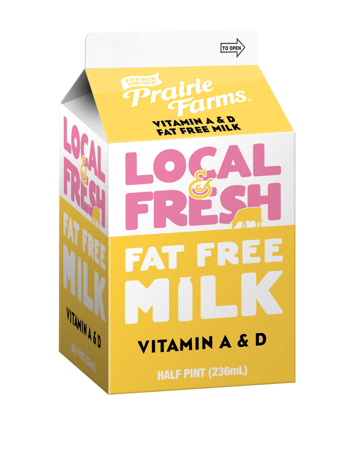
Do you remember sitting in the cafeteria as a kid and staring at your half pint milk carton designs? I remember the old Prairie Farms design that was a miniature of the gallon design.
A lot has changed since the 90s and the new school milk packaging, while limited to two colors in printing, wanted to communicate more to consumers. I set up a new series of designs that would appeal to a k-12 demographic.
Strong typography and bold colors tell right away the fat content and flavor and delivers the Local & Fresh messaging. My favorite part of the design is the small cow grazing under the title.
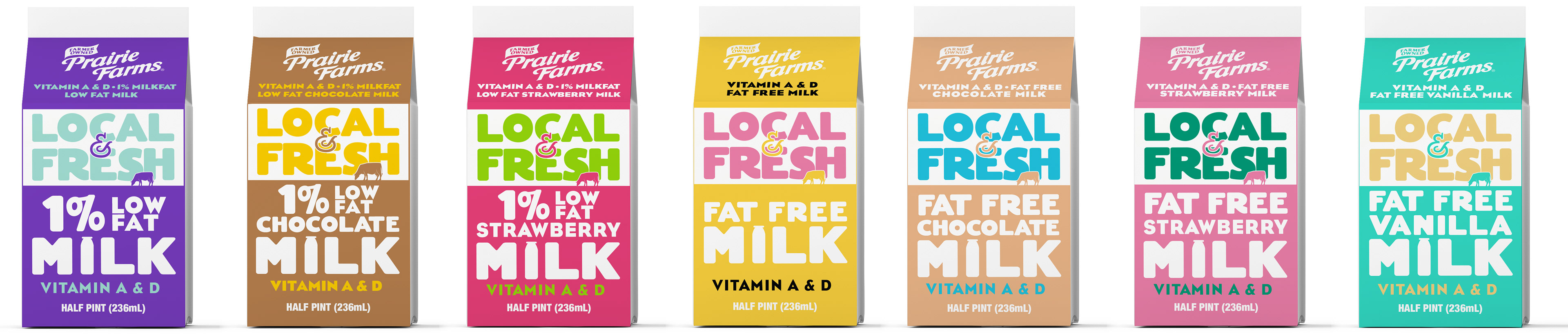
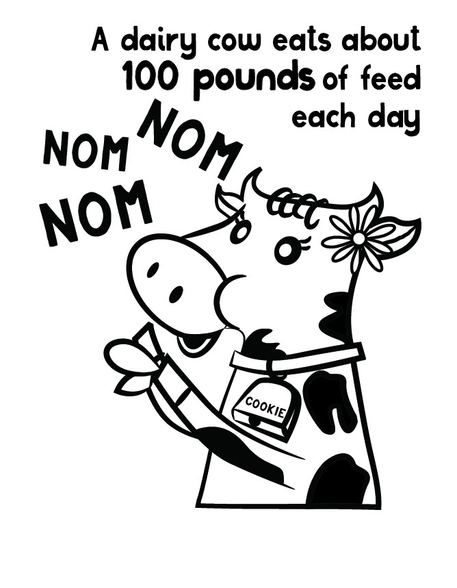
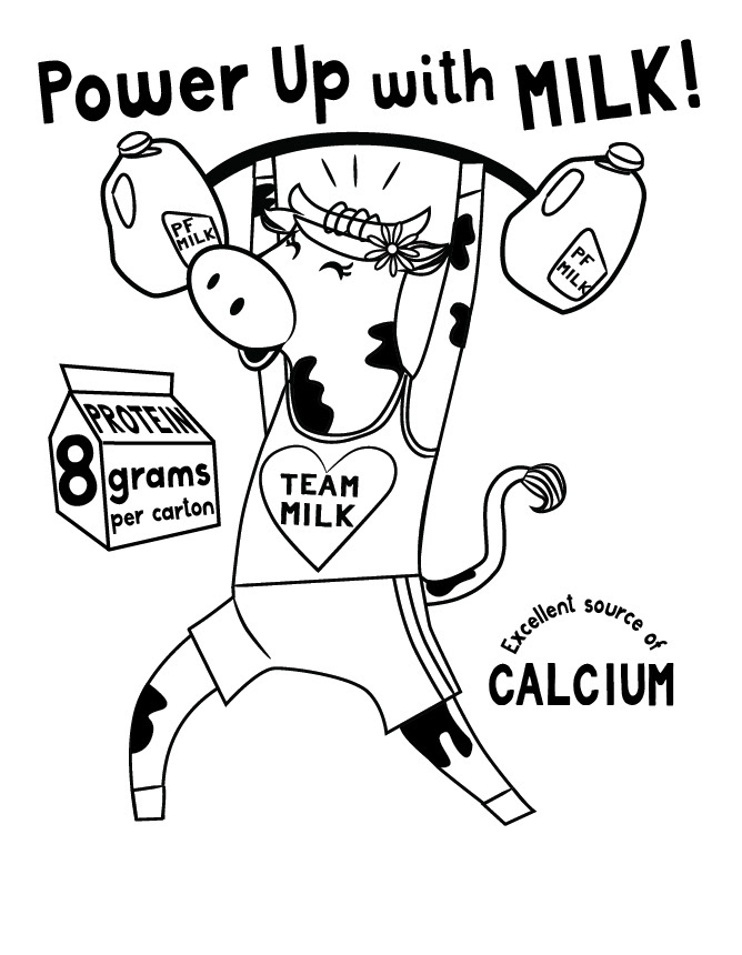
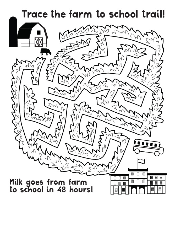
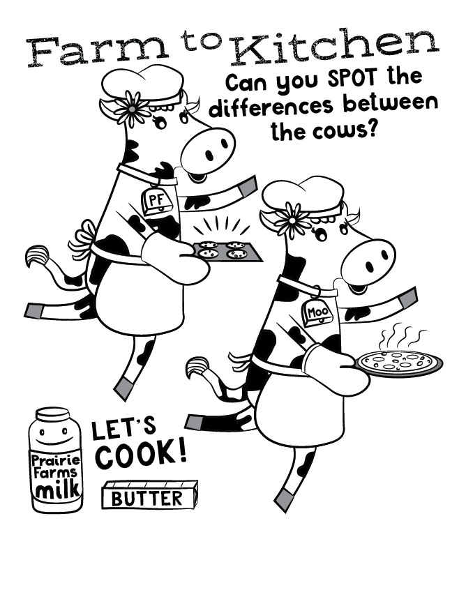
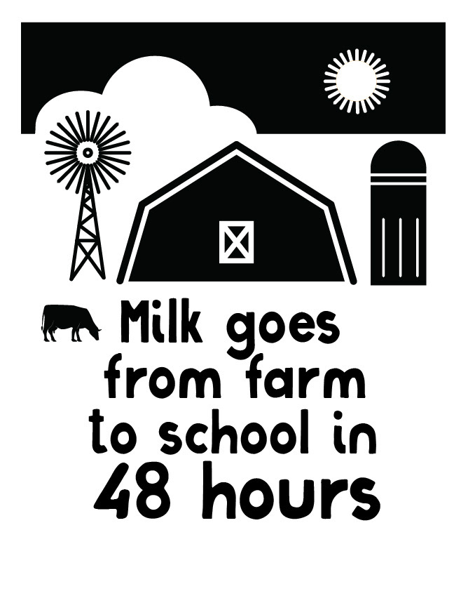
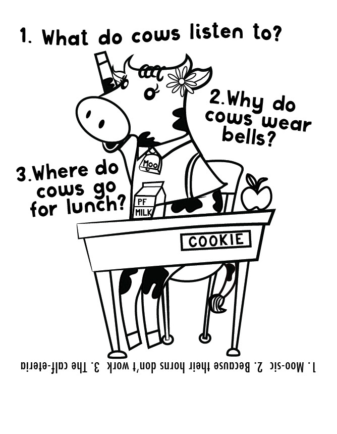
Since I'd developed the Cookie the Cow character for back to school collateral I was excited to incorporate her into the one-color side panel graphics. Also some graphics to direct back to features on the website.